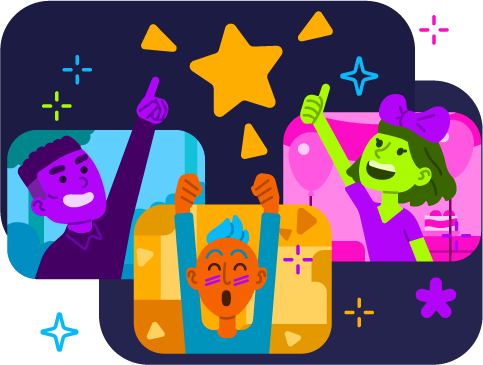
absurd:joy 2021-2023
UX Design, Pipeline Development, Design Systems, Accessibility, Feature Design, Figma, Notions, Shortcut, Product Board, Unity
Design Team
Head of Design & Art Direction by Lyndsey Gallant
UI Art by Brittany Kolar
Illustrations and Avatars by Nikolas Odic
UI Art by Brittany Kolar
Illustrations and Avatars by Nikolas Odic
Project
Tangle was a culture tool used to build an “always on” space for remote teams to communicate and collaborate, targeted primarily at small to medium creative teams.
Role
As principal UX designer, my responsibility was to lead the design of Tangle’s entire feature set, and bridge the gap between product, art, and engineering to ensure our team worked collaboratively with a human-centered approach.
Summary
Tangle initially began as a prototype to improve moment-to-moment communication when the market didn’t offer much beyond existing video call platforms. That prototype was loved by various creative teams and became the anchor for a product that changed the conventions around how remote productivity tools and communication currently work.
Our goal with Tangle was to create a safe environment that allowed you to build a virtual space that felt good to be in; that allowed you to communicate with others comfortably, and safely, and that fostered space to build a healthy remote culture.
With our core team having a strong and diverse background in game development, we used that experience to build a tool that felt like more than just a piece of software, but an enjoyable experience that we loved to use every day.
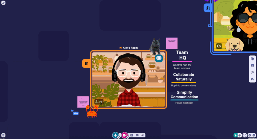
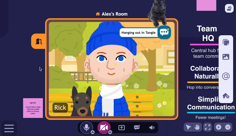
Tangle founders, Alex & Cy introducing themselves from within a Tangle server.
Challenge
Creating a virtual space that protects your psychological safety, and brings joy to your day-to-day remote environment.
1. Design for positivity and safety
2. Create a space that feels good, and accessible to navigate
Design for positivity and safety
It was imperative to deploy a design process where everyone's voice mattered. As the developers, we were using our own product everyday, and thus our day-to-day interactions provided insight to the nuances of remote interaction that made us feel “unsafe”.
A common concern with an “always on” environment is the control around our own devices. Our own team members would speak of the of anxiety over how visible or audible you are whether you're partaking in a discussion or just idling in your own space within a Tangle server. Life happens and everyone’s situation is different. Therefore it was important to give as much control over a persons audio and video to allow them to feel as safe as possible, but without it feeling tedious.
An example of features that were developed from our own day-to-day anxieties:
1. Allow users to automatically mute their microphone and disable their camera when they leave a conversation to avoid active device anxiety.
2. Manage “hot” microphone situations with a "request to mute" option to avoid disrupting a conversation, and remove any judgement on the user with the live microphone.
To tackle these problems, we developed a production pipeline derived from the Double Diamond Design Process. We used a multiple phase pipeline to ensure every team involved in feature development had a clear understanding of what each teams responsibilities and expectations were in each stage.
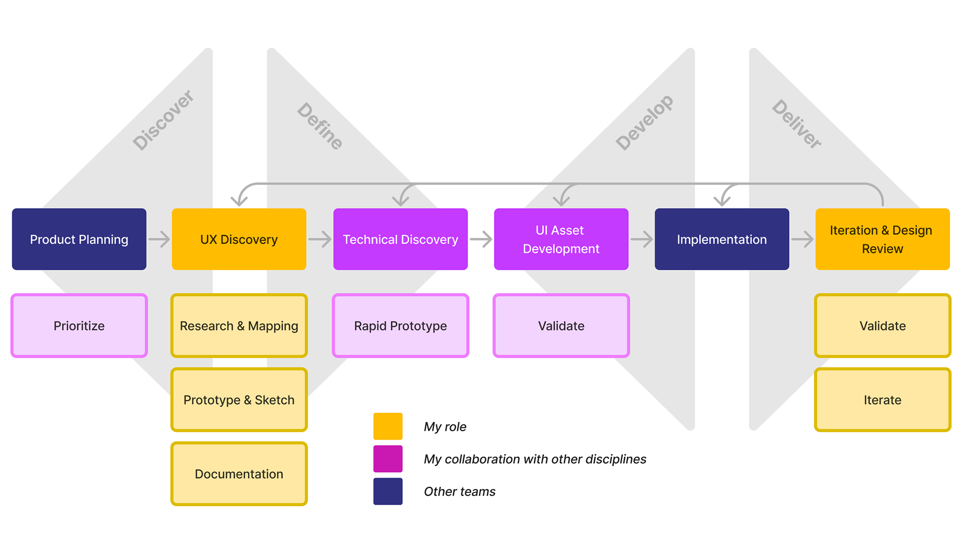
A high level view of how my role touched various stages in our design process
Product Planning
As the representative of the design team, it was important for me to be part of product discussions to ensure that UX dependencies between features were understood and to assist in communicating any concerns where design debt for both UI and UX could occur without proper prioritization.
UX Discovery
Questions were asked to our team and users to understand when we felt most anxious about our microphones being on.
Users identified their anxiety was highest when you return to your own room after a conversation, or when a group of people have left your room and you are alone.
This was an effect of having a persistent, always on environment, versus having an intentional end of a transmission that closes a conversation.
In the case of auto-muting, triggering a mute is relatively easy to implement without any need for further prototyping. By providing a clear user flow of when a microphone should be muted, we could quickly implement this feature and test with the team as soon as possible.
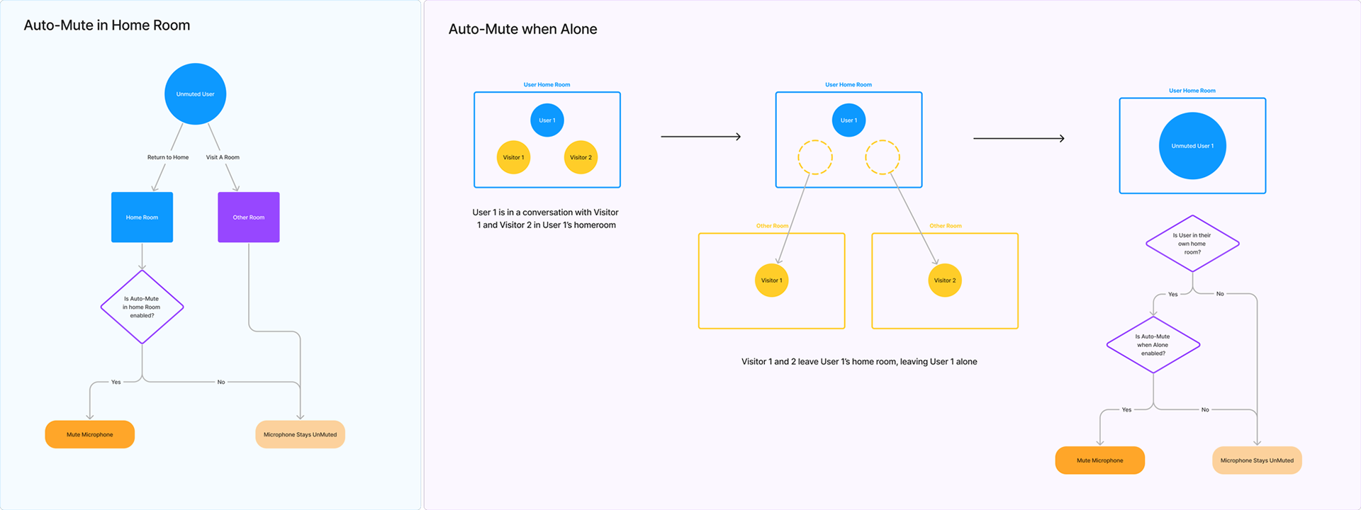
A user flow how when an auto-mute can be triggered
The "courtesy mute" would require more thought with how it would need to be presented to the user visually. We used more time to ensure we crafted a design that respected the safety of a person receiving the request.
Some key targets we discussed based on our research were:
1. Ensure the receiver does not feel judged
2. Enforce limits to avoid spamming
3. Give gratitude as feedback
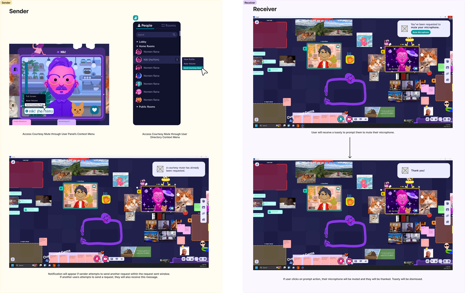
How I visually mocked out how a courtesy-mute would be presented to the sender, and to the receiver. Placeholders were used to indicate where we would need context specific icons to support the toast notification.
This proposal is then made available to the whole team to allow for input and inspire any other valuable ideas that could better the feature. Notions was our tool of choice that allowed me to organize and filter feedback that would be useful to improve our design.
And example of this was the suggestion of other ways we could incorporate our auto-mute. We used a database to organize our user facing system settings to make it easy to add options that only needed a visible toggle.
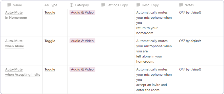
A table is used to keep track of our user facing system settings.
This is paired with a component kit from our UI Design System.
The proposal is then cleaned up and presented to our main stakeholders to ensure we have addressed effort, time, scope and any dependencies that may or may not be required. From there it is broken down into actionable stories where we work, iterate and test until we’re satisfied with the solution.
It was very important, as the sole UX designer, to remind myself that I alone will not come up with the best answers. Our best solutions came from listening and bringing together the ideas of everyone involved.
The result was that feature was very quickly favoured by both our team and users, and became a selling point for how we protected your safety in virtual spaces.
Create a space that feels good, and accessible to navigate
What started as a playful joke became a common question we used to remind our team of how to think of usability in a day-to-day context:
“Can I use Tangle while holding a cup of coffee in one hand?”
Although this statement is extremely broad (disclaimer: we do not claim to be accessibility experts with broad assumptions), framing accessibility in a way that was relatable to everyone made it easier encourage creative thinking around how we used our product.
We worked with an accessibility consultant that audited our core features. They assisted us with keeping within our targeted accessibility goals and helped us investigate solutions to make our interface more usable with other inputs, such as keyboard and trackpads.
An example of easily navigating between rooms and people, by automatically focusing and zooming on targets.
An example of how well received our tool was to our consultant was the ability to seamlessly zoom in and out of your Tangle space. It was a huge boon to visually impaired or those that simply wanted a "closer look". Without having to resort to buried features to increase UI size, we're able to easily increase or decrease the UI by nature of how we navigate the space.
Although not used in our public build, we were even able to explore navigating Tangle with a game controller if wanted to!
Although not used in our public build, we were even able to explore navigating Tangle with a game controller if wanted to!
Avoiding skeuomorphism, within reason.
As game developers, we love to build worlds and spaces that are enjoyable and engaging to interact with. So we wanted to use this same philosophy when designing a communal space.
Creating an abstract space removed the uncanny feeling of being forced into a predesigned space. Combined with our various tools, such as stickies, images and links, it allowed people to make their space as chaotic or as organized as they pleased.
However, it was still important to not let ourselves try to reinvent common conventions that could hinder how easily someone could learn how to use our interface.
For example, “doors” were still used as an affordance to allow users to quickly understand how to navigate rooms and control their privacy. Even though we designed rooms and the overall space to be abstract, the doors are recognizable symbols to inform their actions as easily as possible.
For example, “doors” were still used as an affordance to allow users to quickly understand how to navigate rooms and control their privacy. Even though we designed rooms and the overall space to be abstract, the doors are recognizable symbols to inform their actions as easily as possible.
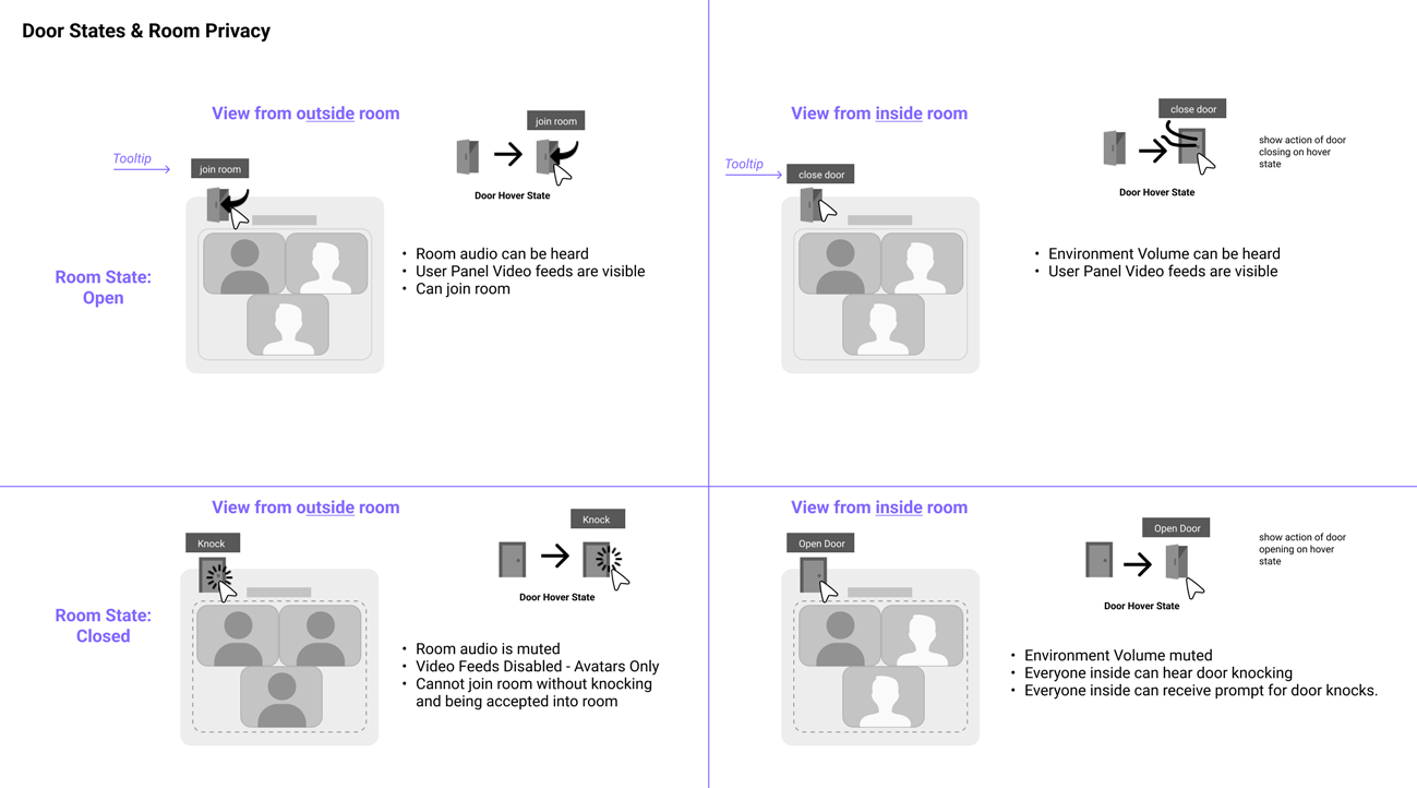
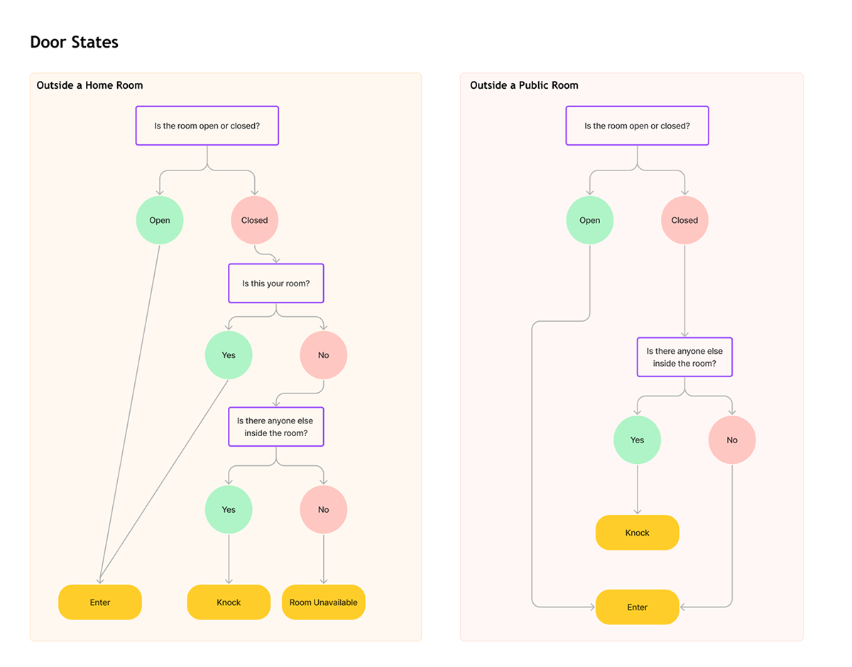
An example of how I mapped out how we address the privacy of a room between an open and closed door, and how to enter a room that is your own versus another person's room.
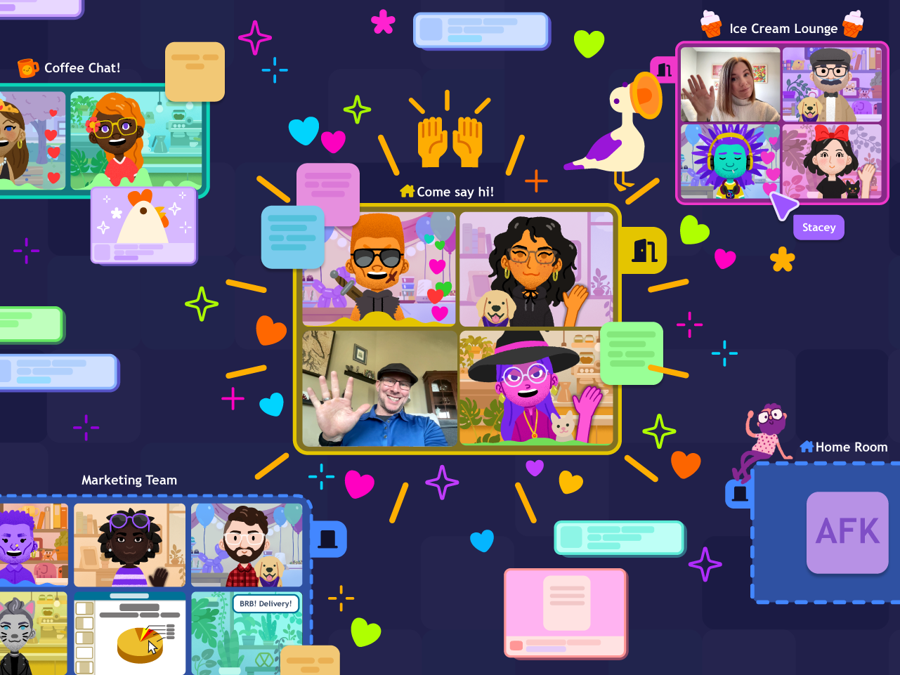
The final result of doors in action.
By not limiting ourselves to a world that mimicked our own day-to-day, we were able to create much more pleasant experience that allowed each individual feel free to use their space without restricting them to the nuances of how a "room" worked in a physical space.
This freedom allowed us to bend and mold our features to allow for better usability and a more fun experience.
Takeaways
There is a need to redefine how we view remote tools - but shifting an entire status quo is still a monumental challenge.
Although our product didn’t capture the market the way we had hoped, there is still an urgent need to change the way we look at remote work as a viable strategy if we expect to adapt with the current climate. This can still be achieved by addressing ways remote tools can improve smaller more day-to-day actions, versus attempting to reinvent an entire status quo.
Highlights included:
A 50% decrease in meetings while using Tangle as their day-to-day communication tool.
Avatars were used an average of 76% while active on Tangle.
No specific tool will create a healthy remote culture for you. But fostering a space to allow for good practices to work, can enable and encourage a culture to grow.
We, as a company, invested a lot of energy into creating policies, processes and long term decisions that encouraged a healthy culture for ourselves. You have the reflect the culture you’re trying to convince the rest of the world to build. Combined with our own product, we were still able to create an incredible work culture that resulted in high-quality work and some of the best collaboration our team had experienced in their careers - all without needing to be in the same physical space.
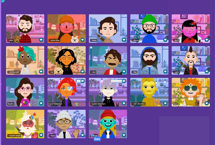
The Tangle Team